3 min readNew DelhiFeb 7, 2026 01:15 PM IST
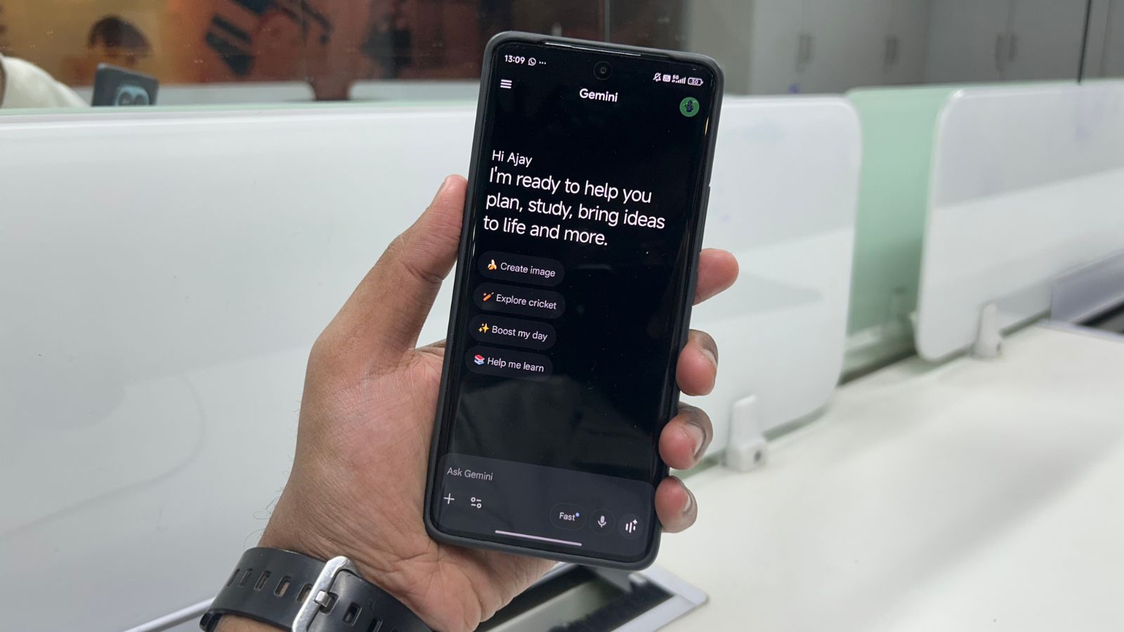
Google is continuing to refine the Gemini experience across platforms. After rolling out changes on the web earlier this week, the company has begun updating the Gemini ‘Tools’ menu on Android and iOS. Alongside the redesign, Google is also revamping the ‘My stuff’ section, removing its preview feature to create a cleaner interface.
These updates are part of Google’s wider effort to simplify navigation while gradually introducing new experimental features.
What’s changing on Android
On Android, the Tools interface has received a refreshed look and feel. The sliding sheet that appears when you press ‘Tools’ is now clearly labelled, making it easier to navigate.
At the bottom of the menu, Google has added a new section called ‘Experimental features’. This area includes a ‘Labs’ badge, signalling that these features are still being tested and may change over time.
For Google AI subscribers in the United States, a new ‘Personal Intelligence’ toggle has been introduced. This option lets users turn the feature on or off for a particular conversation, giving them greater control over how the Gemini assistant responds in each interaction.
iOS now has a more consistent look
On iOS devices, Google has modified how the Tools menu is presented to make it a better match with the rest of the application. As opposed to using a pop-up style menu native to iOS, Tools uses a bottom sheet style similar to the existing model picker.
The change makes the experience feel more consistent across platforms. The ‘plus’ menu used for adding attachments, such as files or images, remains unchanged for now.
Story continues below this ad
The redesigned Tools menu is currently rolling out to users, so availability may vary depending on region and device.
‘My Stuff’ drops preview feature
Google is also changing how ‘My stuff’ works on Android and the web. Previously, the section showed previews of your three most recent items. That preview has now been removed.
On the web version of Gemini, the section is paired with a playful star-shaped smiley icon. The removal of previews results in a simpler and less cluttered side panel, making it easier to focus on conversations.
At the same time, iOS users are beginning to see an updated organisation for documents and media. This layout was first introduced on the web and helps separate saved content more clearly. However, this particular change has not yet reached Android users.
© IE Online Media Services Pvt Ltd